
Bloom & Petals
An online florist for all customers, whether they have allergies or pets or they want to place one order for multiple addresses.
-
Role
UX researcher and designer
-
Responsibility
User research
Wireframing
Prototyping
-
Duration
April to May 2022

The problem
Based on user research, four primary pain points have been identified:
Expectation vs reality
Insufficient knowledge of flowers
Inadequate information on allergens and plant toxicity
Product availability and delivery times
This project will primarily address the latter two issues, as the first can be resolved through improved communication with florists, while the second necessitates further information and gardening experience. The final two concerns are more closely linked to UX design.
Ordering flowers online offers convenience but may not suit everyone's needs, particularly those with allergies and pets. Relevant information is often lacking, and when available, it is not easily accessible due to the absence of a clear categorisation system. Consequently, customers must sift through descriptions and filter options individually.
Additional challenges include uncertainties surrounding product availability, delivery times, and the option to deliver to multiple addresses. Addressing these issues can significantly enhance the user experience.
The goal
The aim is to develop an online store featuring a pet-friendly section that showcases non-toxic and hypoallergenic plants. Additionally, the webshop should include a user-friendly checkout page that offers the flexibility to deliver to multiple addresses and select specific delivery dates.

User research
Expectation vs reality
Determining the actual size and visual appearance of a bouquet can be challenging based solely on a brief product description. Additionally, at times, the flowers may arrive in a budding stage rather than being fully bloomed.
Lack of knowledge about flowers
The majority of individuals possess a limited understanding of flowers, which can lead to difficulties in selecting and maintaining them properly.
Allergens and Toxicity
The selection of flowers may be restricted for individuals with allergies or pets. To safeguard the customers' well-being and support the florists' interests, it is essential to provide pertinent information.
Pain points
Availability and delivery time
Long processing times can heighten stress for last-minute shoppers, while ambiguous stock availability and delivery schedules may result in reduced user satisfaction. Additionally, customers may sometimes prefer to deliver items to multiple addresses within a single order.
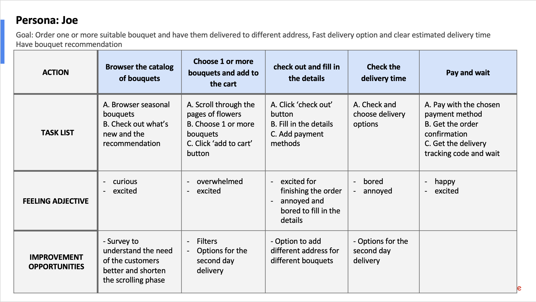
Perona: Joe
Problem statement:
Joe, a full-time data analyst and father of two, seeks a quick and efficient way to order bouquets for delivery to various addresses on special occasions, as he wants to bring joy to his family.

User journey map
Mapping Joe’s user journey helps to design the webshop.

Starting the design
Paper wireframes
Following a brainstorming session to explore various functionality combinations, I've identified key elements that contribute to a seamless user experience, denoted by stars on the right. These components include a carousel introduction, a section highlighting the florist's unique selling points, recommendations, testimonials, and an information bar at the bottom. Furthermore, I've also created a wireframe to illustrate the layout on mobile devices.


Digital wireframes


Home Page
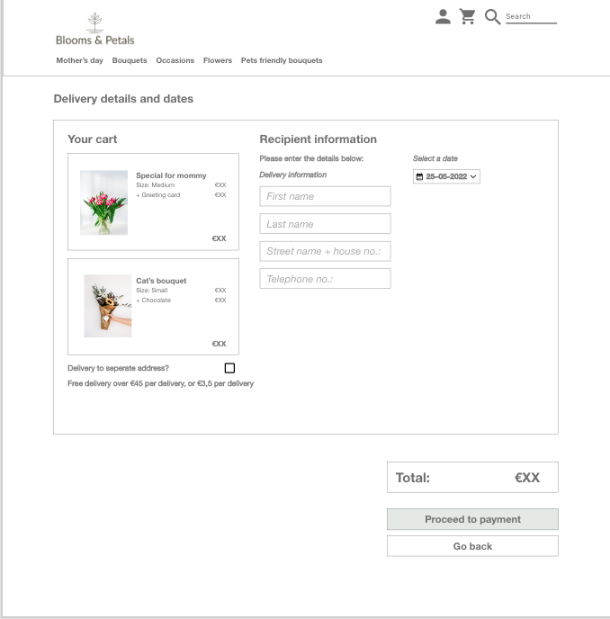
Check out page for delivery details and date
The primary objectives of the homepage are to captivate potential customers and enable them to quickly locate their desired products. To facilitate this, a comprehensive menu bar organizes bouquets by occasion and flower type. Additionally, the most imminent occasions are featured prominently in the menu, as customers are likely to be purchasing for those specific events during that time. Appealing product images, unique selling points (USPs), and testimonials are also displayed to further engage customers and boost their confidence in the store.
What’s unique about this page is the option for delivery to a separate address; the customers can select the delivery date individually. If customers deselect the option, they only need to fill in one address.
Low-fidelity prototype
The low-fi prototype shows the user flow from entering the home page to selecting a bouquet, checking out, filling in the payment and delivery details, and completing the payment.
View the Bloom & Petals low-fi prototype

Usability study findings
Goal
Identify the particular challenges users face when performing essential tasks within the app, such as navigating from the homepage to other product pages, adding products, choosing additional add-ons, selecting various delivery options (to a single address or multiple addresses), and completing the payment process.
Round 1: low-fi
Add a drop-down menu on the menu bar for [bouquets], [occasions] and [flowers] to give a clearer idea.
Change the colour of the buttons on the product selection page to indicate which items are selected.
Round 2: high-fi
Determine the specific difficulties users encounter while executing key functions in the app, including transitioning from the homepage to other product pages, adding items, selecting extra add-ons, choosing between different delivery methods (to one or multiple addresses), and finalizing the payment process.

Refining the design
Mockups
The first one is the home page of the online florist shop. After the usability study, I added a drop-down menu that shows different bouquet categories, including wild bouquets, charity bouquets, bridal bouquets, and more. The same drop-down menu also applies to occasions and flowers.


The second one is about the buttons on the product page. After the usability study, I added a tap mode to the buttons. So when they are selected, the colour will reverse. Also, when the user decides to add a card, an extra option will appear to let the user select the desired card and enter card text.
The third one is about the product page too. Instead of directing the users to the shopping cart once they add an item, I changed the button to [Added to cart] to prevent confusion.
More screens


High-fidelity prototype
The high-fi includes several updates to the text buttons and functionalities based on the mock-up.
For the complete prototype, please visit here.


Going forward
Takeaway
Impact
This online florist simplifies bouquet selection for customers with allergies and pets through a dedicated pet-friendly page, and offers the convenience of delivering a single order to multiple addresses for unique situations.
What I learned:
Ensuring a seamless process for adding items to the cart is crucial for an enjoyable user experience. Leveraging various button states and utilizing a sticker sheet can help create a more intuitive interface, which are aspects worth becoming more familiar with.
Next steps
1
Conduct another round of usability studies to determine if the users’ pain points were reached.
2
Conduct more user research to determine any new areas of need.

Let’s connect!
Thank you for reviewing my Bloom & Petals webshop!
If you’d like to see more and get in touch, feel free to connect.